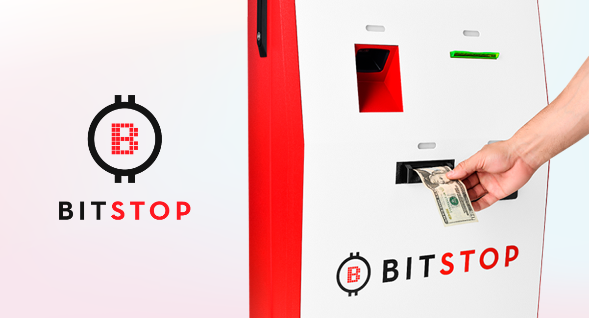
Bitstop is a Bitcoin ATM and software company making buying Bitcoin with cash simple and accessible. Customers insert cash and bitcoin is instantly deposited to their bitcoin wallets.
End-to-End Product Designer
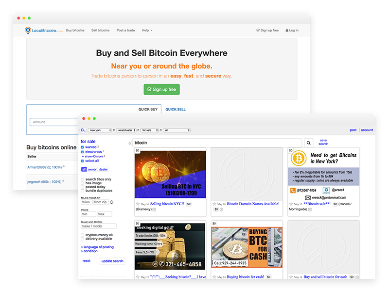
Before bitcoin ATMs existed, people would need to go on a website like local bitcoin or craigslist and take the risk of exchanging money in person with someone they met on the website.
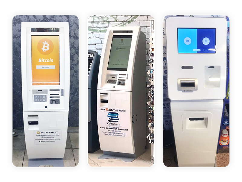
Bitcoin ATMs came about as a solution to make buying bitcoin with cash secure and convenient.
In the United states the lamassu (on the right) and gen mega (on the middle and left) were the most common manufacturer models for bitcoin ATMs.
When I joined Bitstop, they had around 50 genmega model bitcoin ATMs mainly in florida and a few in california. The problems bitstop faced were:
Being that genmega was the most common model, even with our red vinyl branded wrap, there was little brand differentiation to customers. All the genmega models used the same template software that allowed little customization.
These factors lead to negative reviews and increasing support tickets regarding the lack of transparency.
Also, to grow the business and expand into new locations quickly and with less overhead, we had the goal of building a franchise program. This was not possible with the current hardware and software.
Our top priority was to grow the business through the execution of a franchise program.
The franchisees would be buying not only our machines but also our brand recognition and trust. So, it was important to improve the customers experience and reduce negative reviews and support tickets.
I believe collaborating with the team early and often at every phase of the process is important for success.
Any project, big or small, I always invest in some level of research.
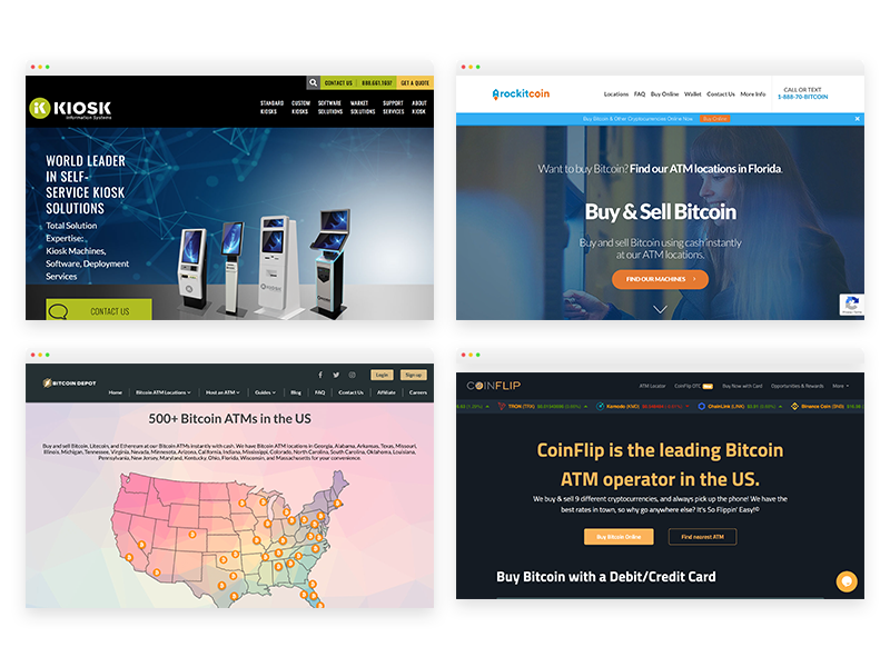
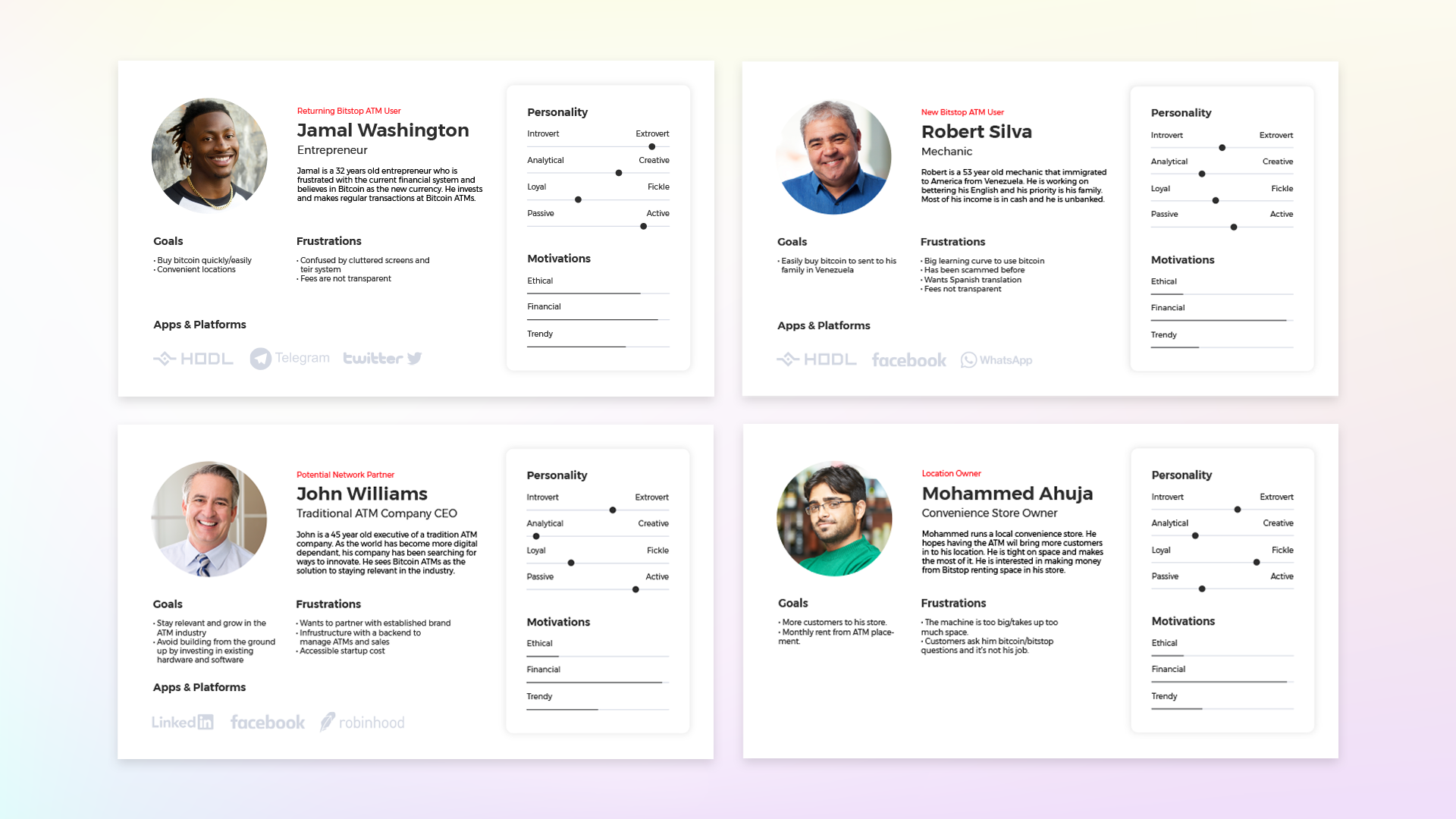
I conducted an in depth analysis of our current and competitors ATM UI/UX to evaluate possible improvements. I surveyed users, and interviewed the bitstop team. At Bitstop, the founders are very knowledgeable about crypto and were involved in it from very early on. I learned a lot from them and they steered me in the right direction in terms of what types of things to look up and who were important players in the space.
Interviewing users and everyone on the team helped me create these personas. I applied the data that I could from support tickets and customer data but there was a level of assumption involved.
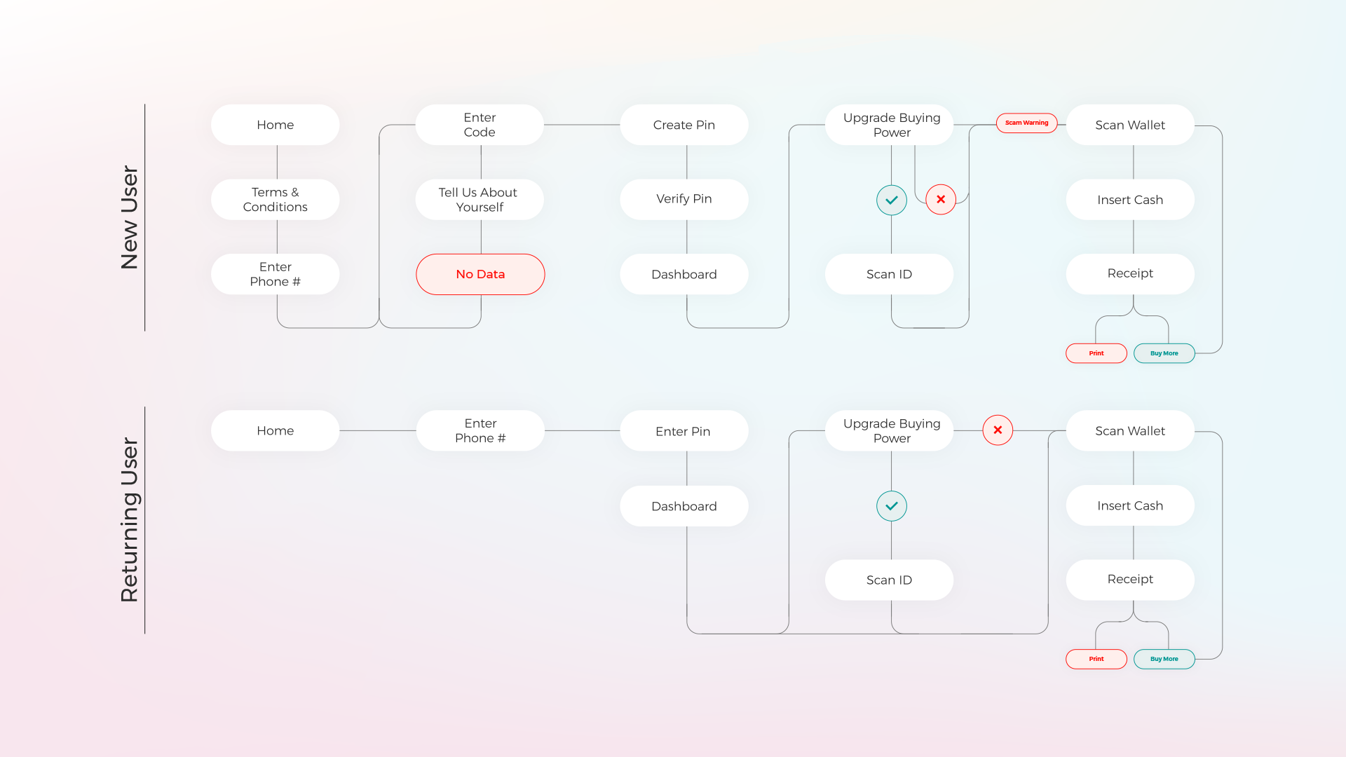
With established personas I moved on to fleshing out user flows. I spent a few sessions white boarding with the dev team, founders, and CCO. Here is an example of the 2 main flows for new and returning users. A couple notable improvements I made to the flow are the warning screen and buy more button.
The warning screen is an important addition to not only stay compliant but to also keep our customers informed and aware. There are common scams claiming people need to use the ATM to pay the IRS or urgent overdue payments and once bitcoin is sent there’s no way to get it back. It’s also another layer of transparency that we hoped would lead to our goal of less customer support tickets.
My reasoning behind the buy more feature is that once customers reach the receipt screen, they used to only have the option to print receipt, now by adding the buy more button, when selected, it prompts to scan wallet for a new transaction. This decision was driven by noting that some new users would make a small purchase to test the machine and then want to buy more after they confirm it works and they gained trust. Rather than having them go through the entire process from the beginning, it’s a quick way to up-sell the customer and prevent that drop-off.
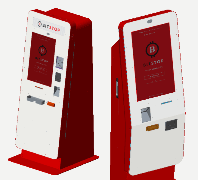
Working with Kiosk to design the ATM hardware was a new, exciting, and slightly scary experience. There was a lot of responsibility to nail the design since they are quite costly machines. I was responsible for assisting with model selection and the ATM esthetics.
We picked a full service machine that can handle both buy and sell. It is a larger model meant for bigger spaces like airports and malls. We also picked a light version that is smaller, is buy only, and is great for convenient places like gas stations. Using the personas made for the franchisees and location owners helped us reach the conclusion to have 2 models for different purposes and at different price points.
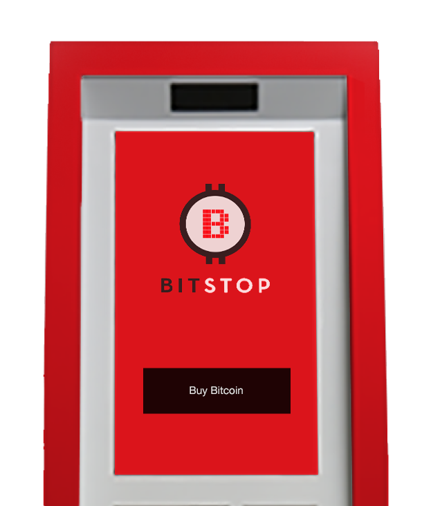
Kiosk also sent me material and color samples for the machine itself and the light box graphic. From my research surveys I knew that keeping the machines red for brand recognition was important. I decided to balance the red with a white approachable front.
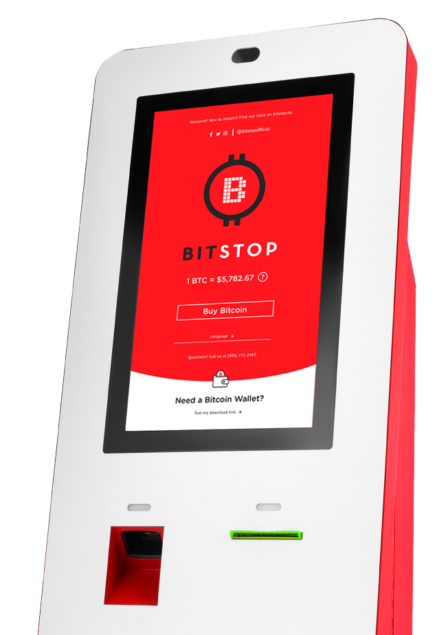
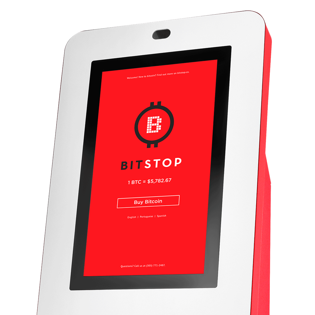
The UI Design phase is my favorite part of the product design process. I am now able to take all the UX research and knowledge gained and apply it visually. The interface was confusing, overwhelming and felt like a computer terminal. From my first interaction with a bitcoin ATM I wanted to improve the UI and feel lucky to have had the opportunity to do so.
Then I began working on the screen design. The previous home screen only had the logo and buy bitcoin button. In the new screen I added:
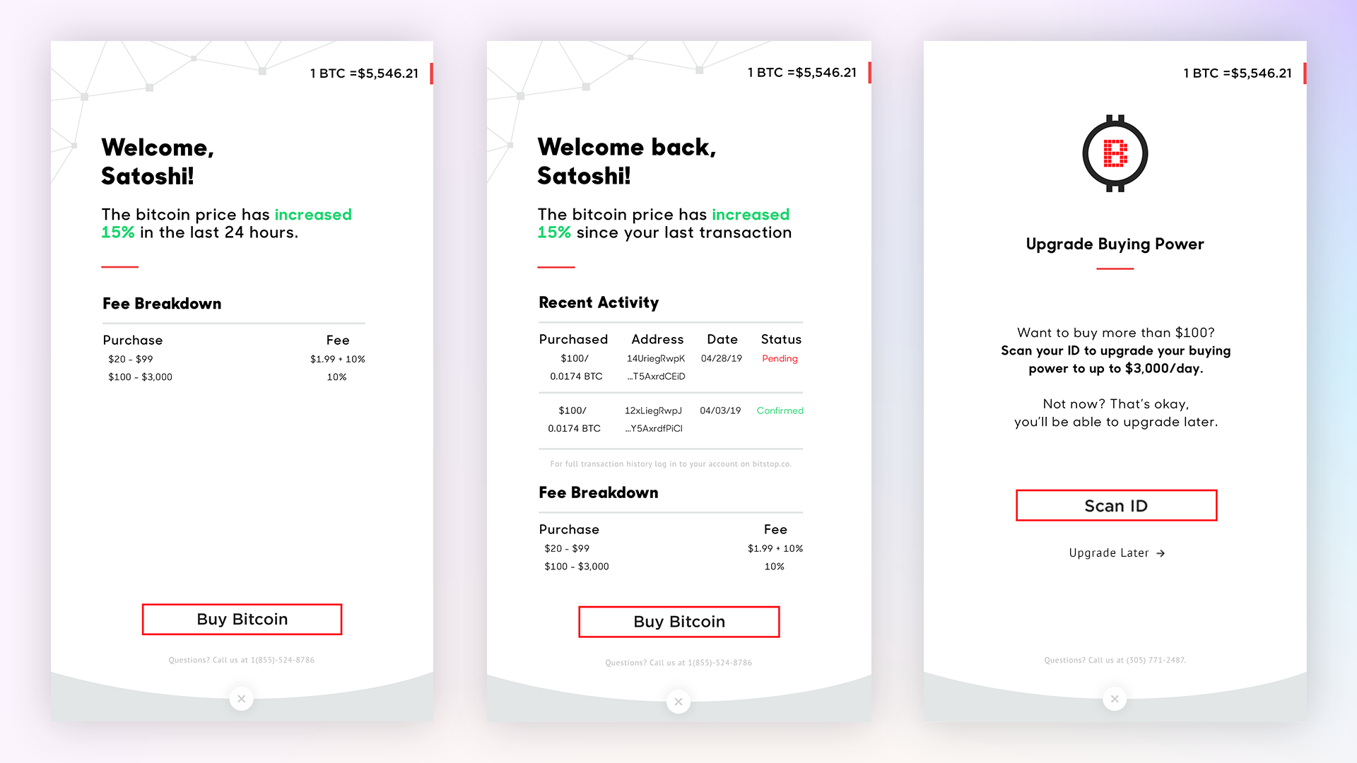
A welcome message on top with our website and social information.
The bitcoin price with an info button that, when clicked, brings up a pop up that allows users to test a mock transaction. It shows users how the bitcoin price and our fee affects their final purchase amount.
Below the buy bitcoin button I added a language dropdown. Looking back to our personas and Bitstop’s mission, many of our customers speak other languages and, especially as we expand to different markets, I wanted to make sure our ATMs are accessible.
I included our support number here and wherever possible to assist at any stage of the transaction.
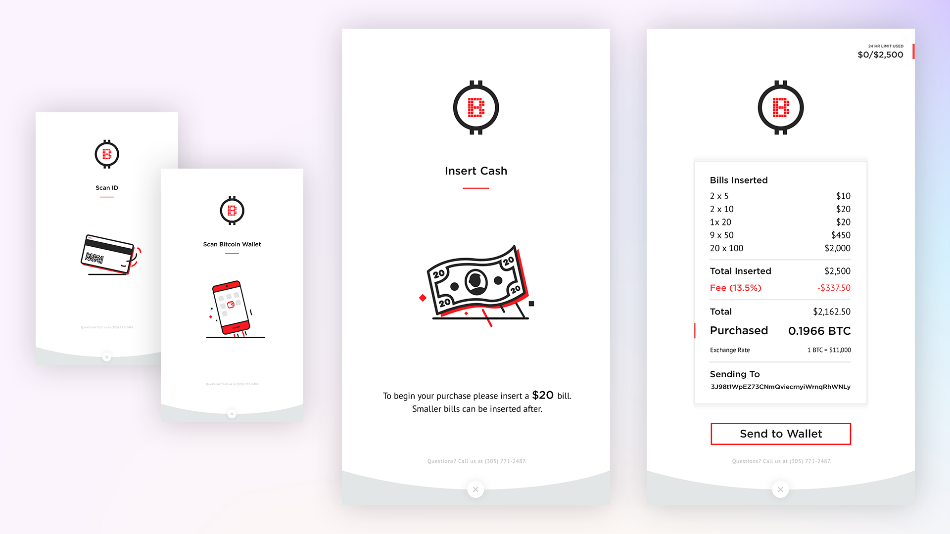
On the bottom of the screen I made it super simple for users who don’t have a bitcoin wallet to access one. they can put their phone number in and get a download link sent to them immediately.
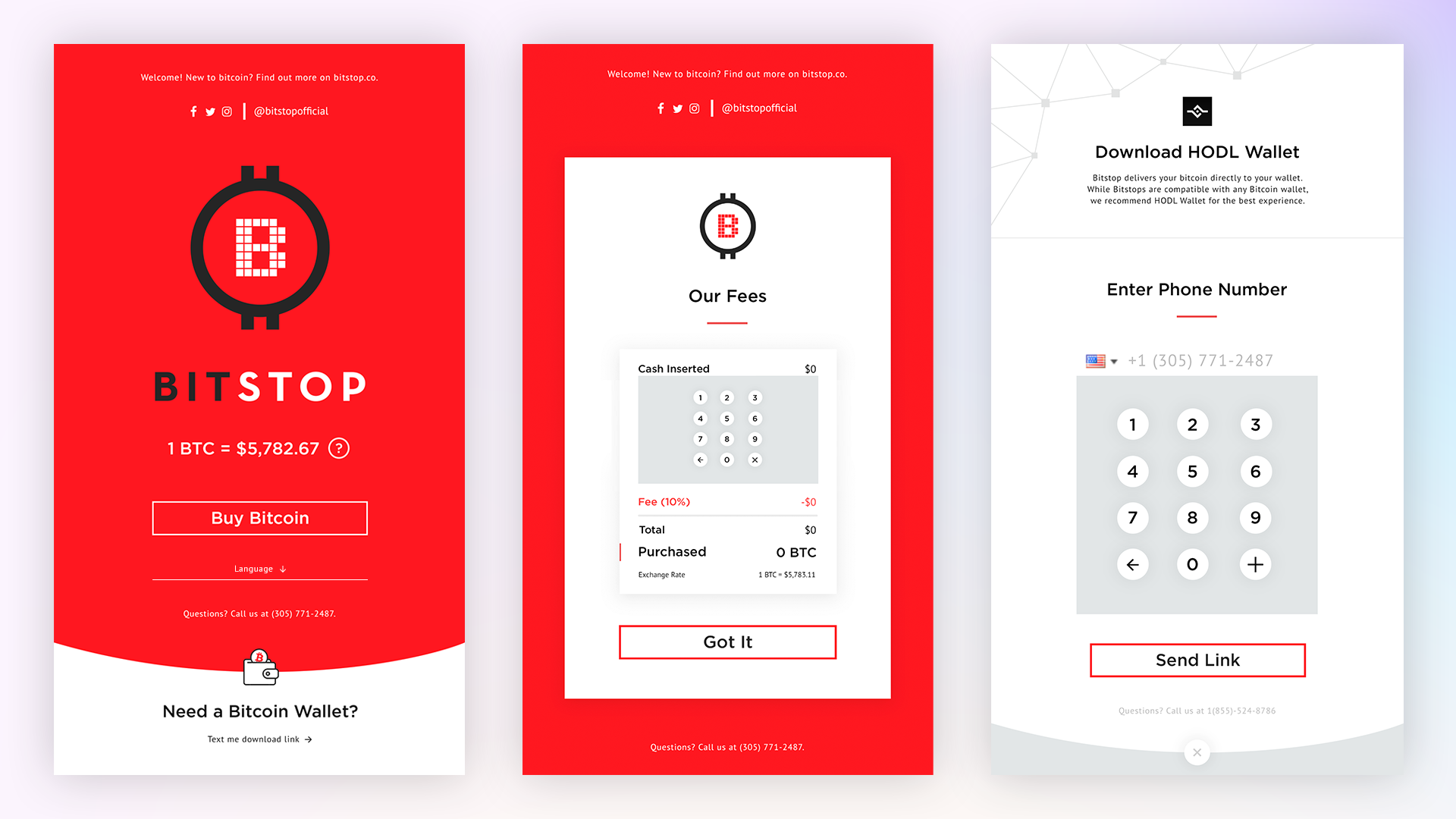
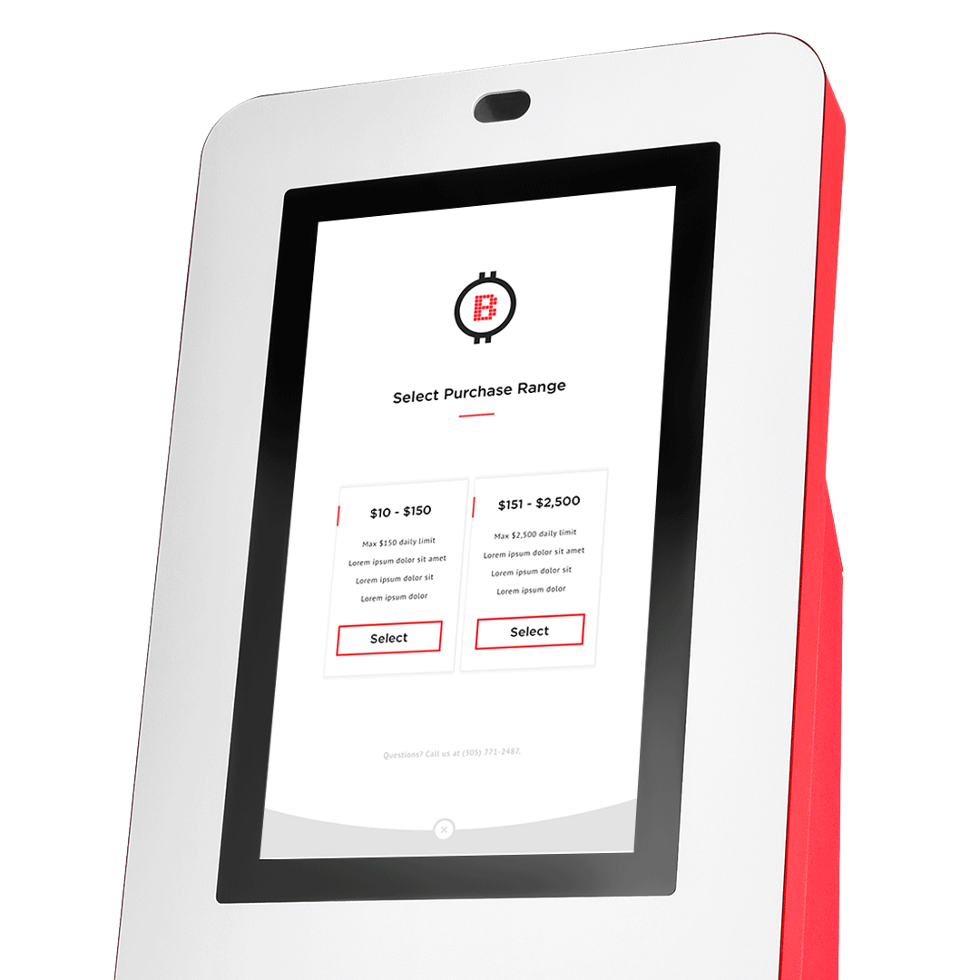
The dashboard was originally a buying tier screen that didn’t give clear context as to why it was necessary to select the tier. So, in my initial design iteration I had users selecting between 2 tiers with more context and in a familiar pattern. But, I questioned why we were having our users make this decision as it was more for compliance reasons rather than user benefit. After noticing during user testing that this screen was still a point of friction for completing a transaction, I met with the team to pitch a solution.
In the end, I removed this tier decision step and, instead, designed a new flow with a dashboard that incorporated the fee breakdown. Users would then be prompted to either 'upgrade' their purchasing power by scanning their ID or select “not now”. This allowed us to maintain compliance while creating less friction for users. If they select ‘not now’ and try to insert more than the lower tier, they will experience that same pop up to scan their ID in order to unlock the ability to buy larger amounts.
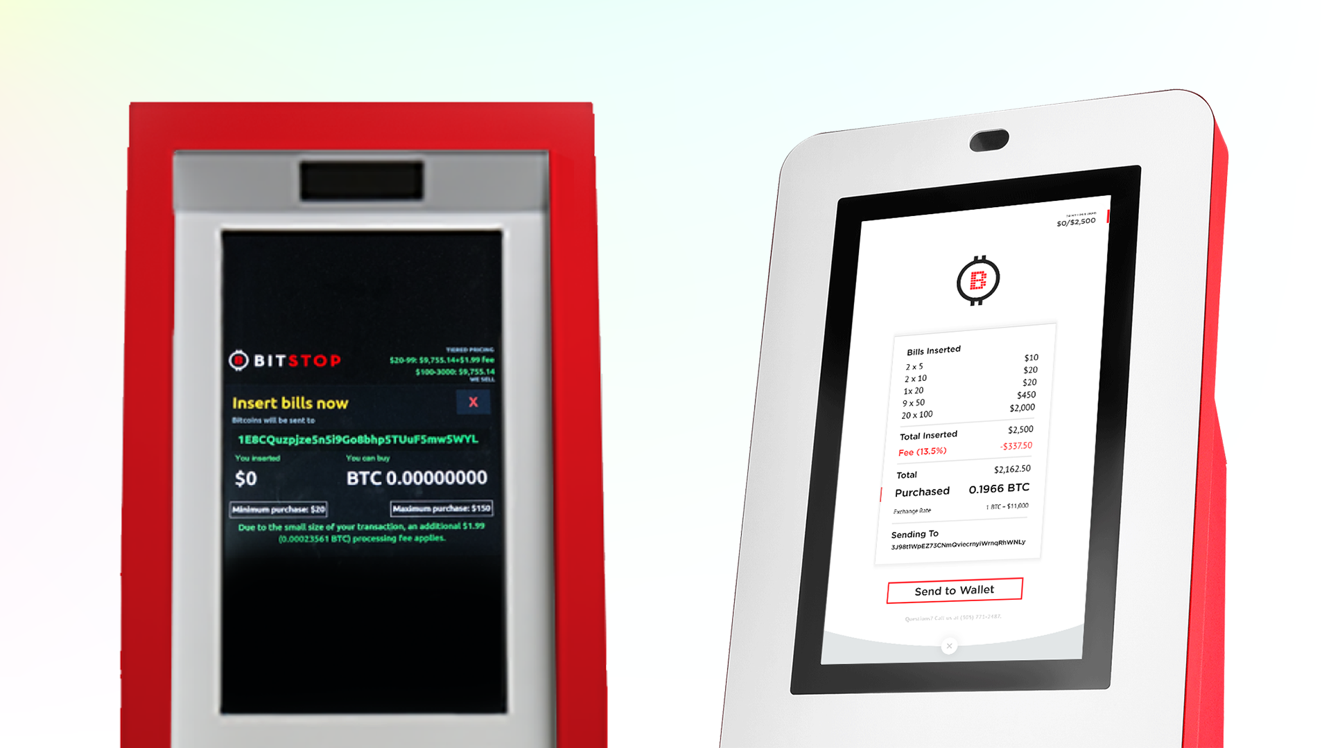
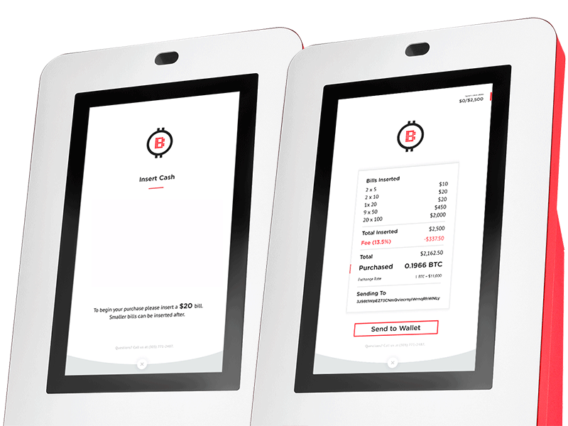
The insert cash screen had major issues with transparency of fees and the exchange rate. Also, the notice for the $20 minimum didn’t explain that it was a bill minimum as well, leading to users inserting smaller bills and the ATM spitting the bill out which triggered a pop up explanation.
To address these issues I first separated the experience into an initial insert cash screen and a receipt mockup screen. The initial screen clearly states to insert a $20 bill with an animation of the $20 being inserted for visual reinforcement. If ignored, the bill will come out and the text would animate bigger and flash red. This $20 minimum needed to be enforced for business purposes and due to the limitations development faced with the bill acceptor.
Once users insert the first bill it takes them to the next screen that shows them clearly
Because of all these factors I needed to take into account, reaching this solution was definitely a team effort.
User testing was key throughout the design process to assess new interactions designs. From testing the last iteration I found that users who had a wallet always completed a transaction successfully while there was a 1/3 drop off for users who did not have a bitcoin wallet at the start of the transaction.
In the home screen section above I mentioned that I added a quick way for users to download a wallet, this was one attempt to have less of a drop off for new users without wallets.
In the end, the launch of the new ATM was very exciting and successful. The business saw massive growth and transparency related support tickets were on the decline.
Partners
States
Locations
Rating on FB
There’s a lot I’m proud of about this project but there’s always room to improve. Some things I would’ve liked to do are: